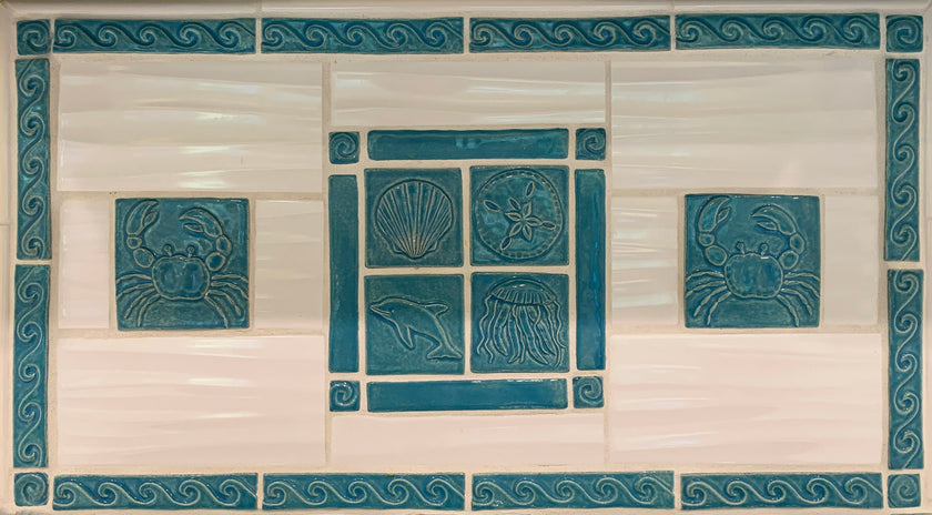
This post is a long time coming! The homeowners contacted me at the end of last year, just as I was getting ready to pause taking new orders for a couple of months so I could work on a really big project. They were willing to wait, but they needed a very specific glaze color for their project. Normally, I don't do custom colors, but I had some glazes that were in the right color family left over from a recent public art project. I sent a few samples, and "Blue Isle" was the clear winner!

A sample of "Blue Isle" glaze next to the completed kitchen
They were first in line when I started taking new orders again. By the time I finished making their tiles, I had fallen in love with this glaze and decided to add to my website as a permanent option for all tiles. Soon it will be an option in the pull down glaze menu; for now it is available by request. Here are the tiles for this project, before they left my studio:

Blue isle is such a happy glaze and I will be forever grateful to these clients for inspiring me to give it a chance. Once the tiles arrived at their new home, the family was kind enough to share photos of the layout and installation process.

There is something magical about seeing a project like this come together!

You can see so much potential in this dry layout.
The white field tiles are by Satori, called Hudson Bright White Motion, and they were purchased at Home Depot. They have a wonderful texture that reminds me of waves and sand.
Here the tiles are installed, but without grout:

Happily, one of the homeowner's sisters is a tile installer, and she is clearly good at what she does! It takes a bit more skill to install handmade tiles than factory made ones, because they vary more in size and shape.

She nailed it! (Figuratively, of course; no tiles were nailed!)

Sea creatures and waves abound in this beachy kitchen...

The clients told me they were initially going to use a lighter color for the cabinets, but as soon as they saw the tiles, they decided to go for a deeper hue to match. I love the result, and more importantly, so do they!

The veins in the quartz counters also have some of this same blue, which is why was so important to get the color exactly right. And they did! This kitchen may not be on a "blue isle," but it seems like a perfect little oasis to me.

Thank you so much, C.L. and family for including my tiles in your project, and for your willingness to wait for them!

