In honor of the new year and the fact that the days are now getting a little bit lighter, I am sharing these luminous bathroom photos. According to the homeowners, the previous décor was rather dark so they wanted to brighten things up, and that is exactly what they did!

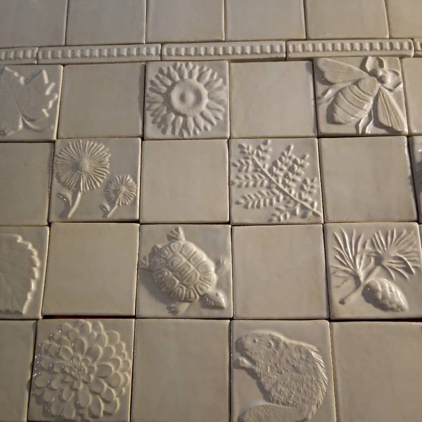
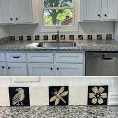
White glaze was selected for the tiles to match the counters and cabinets.

A row of four by four inch tiles is capped by a row of one by six inch ribbon tiles.

The tiles are installed over both of the two matching sinks. They add a little bit of subtle variation without overwhelming the space.

All the elements work together in a very attractive way in this room. Thank you so much, M.D, for including my tiles in your project, and for taking the time to send pictures! Here is another photo of the tiles in my studio before I sent them out.

It is SO MUCH fun for me when I get to see where the tiles I make end up! Will share photos of another bathroom with a very similar tile layout, but a different color scheme in the coming days.
Update 1/22/22: Link to a similar installation using autumn glaze instead of white.

