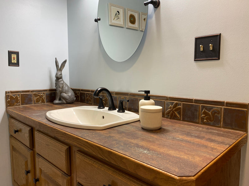
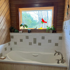
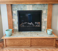
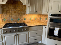
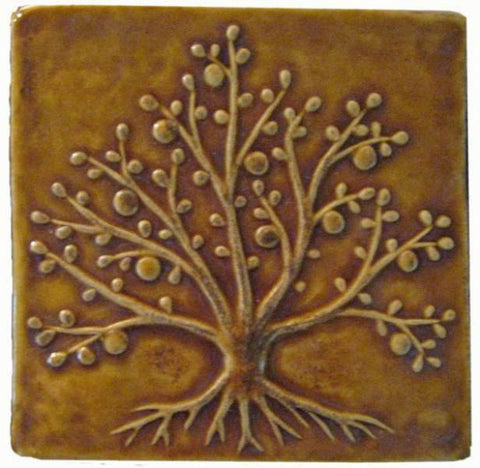
The owner of this bathroom originally wanted the tiles to be glazed in white, but then switched to autumn instead after talking to a friend. I think she made the right decision!

The autumn glaze really shines alongside these counters and woodwork. They all have similar variegation which makes everything pleasingly harmonious. Counters are "fired steel" by Wilsonart.

close up of the tiles before they left the studio
These installation pictures appeared in my inbox within 24 hours of receiving another set of pictures of a very similar installation that used white glaze instead. That bathroom looked better with white, this one is better in autumn. There is no one right glaze for every situation. It is always a matter of setting and personal taste! Speaking of personal taste, I am rather smitten with the rabbit sculpture in the corner, as well as the nature paintings by the homeowner's daughter, L.C., which you can see reflected in the mirror:

Here is a close up of L.'s charming little paintings:

That is a lot of art for such a small room! All of the art depicts animals and plants that can be found in the surrounding area. Fantastic! Thank you so much J.B. for including my tiles in your project and for taking time to send photos!

